Theatre Lila Laboratory
Logo Redesign
CLIENT
Theatre Lila Laboratory [LINK]
FREELANCE DESIGNER
Lauren Robertson
“At the core of my being is a desire to create space, workshops or stories to bring people together to feel authentically connected.”
-Jessica Lanius
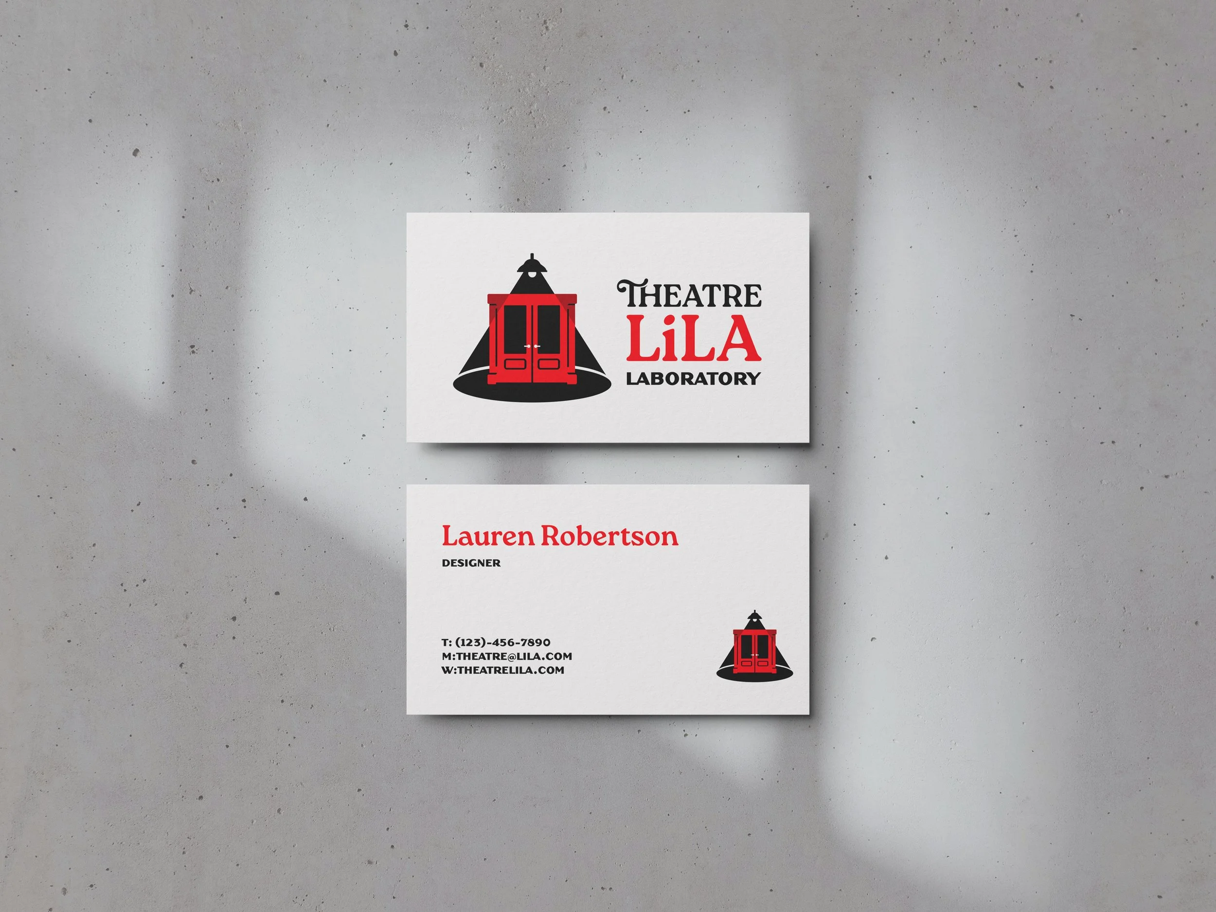
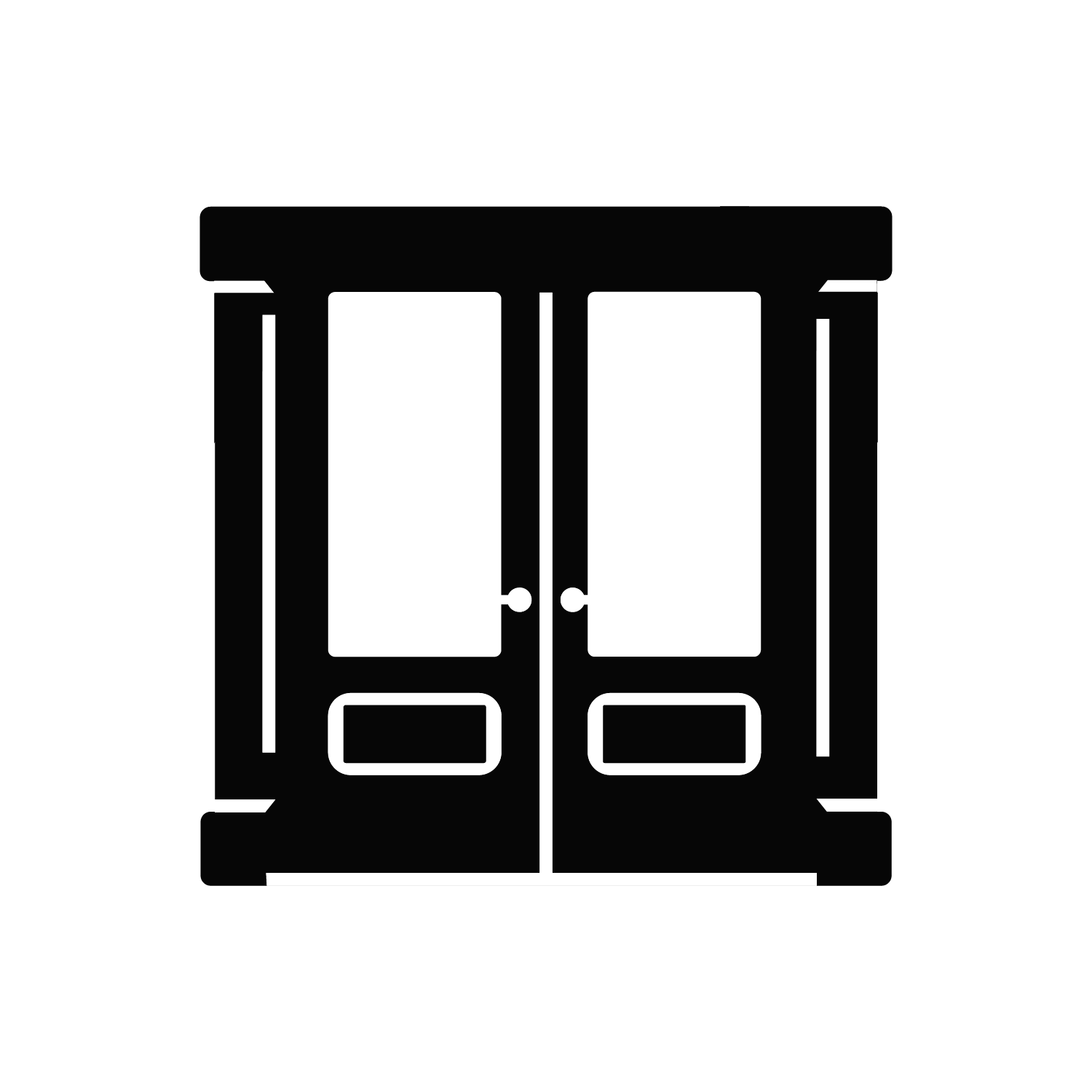
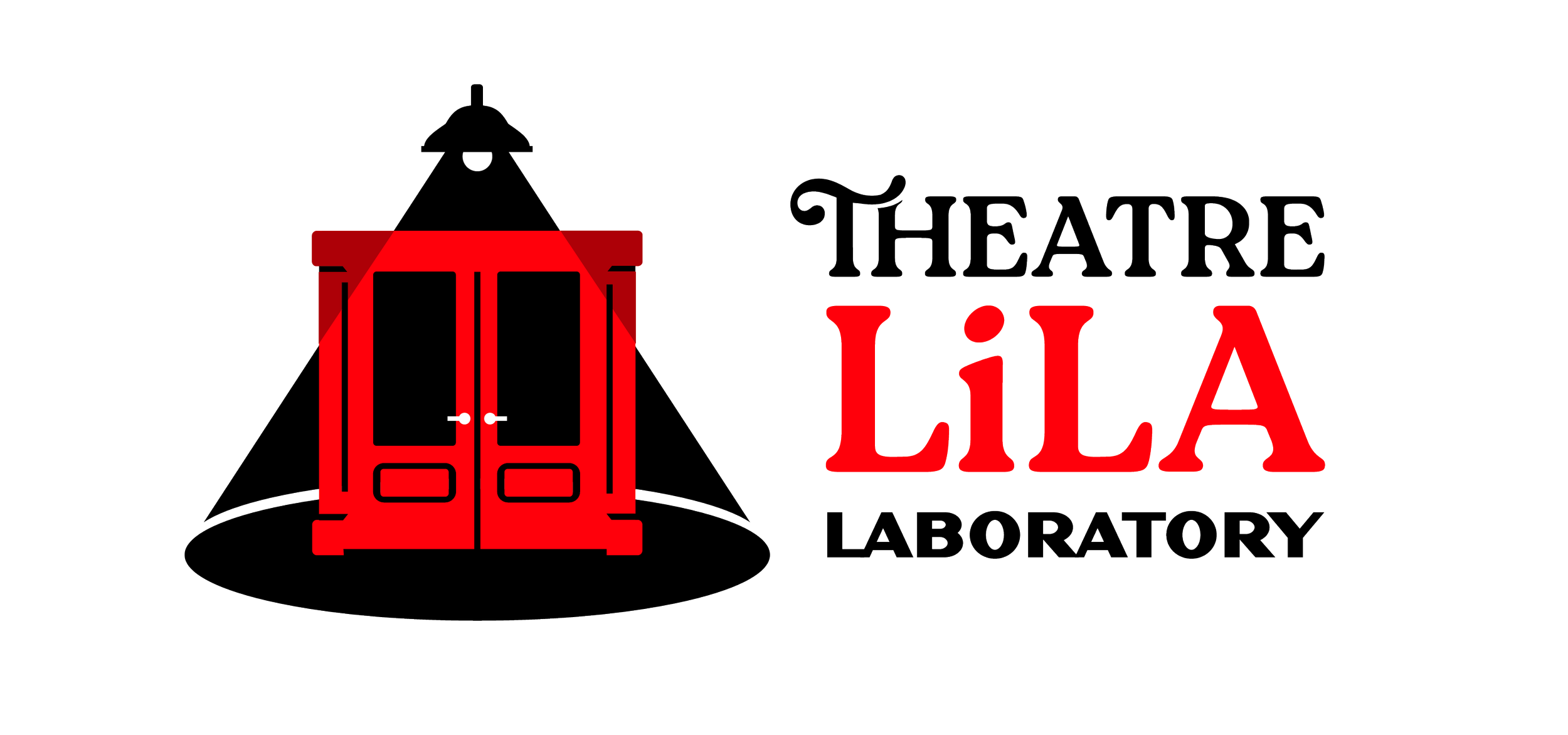
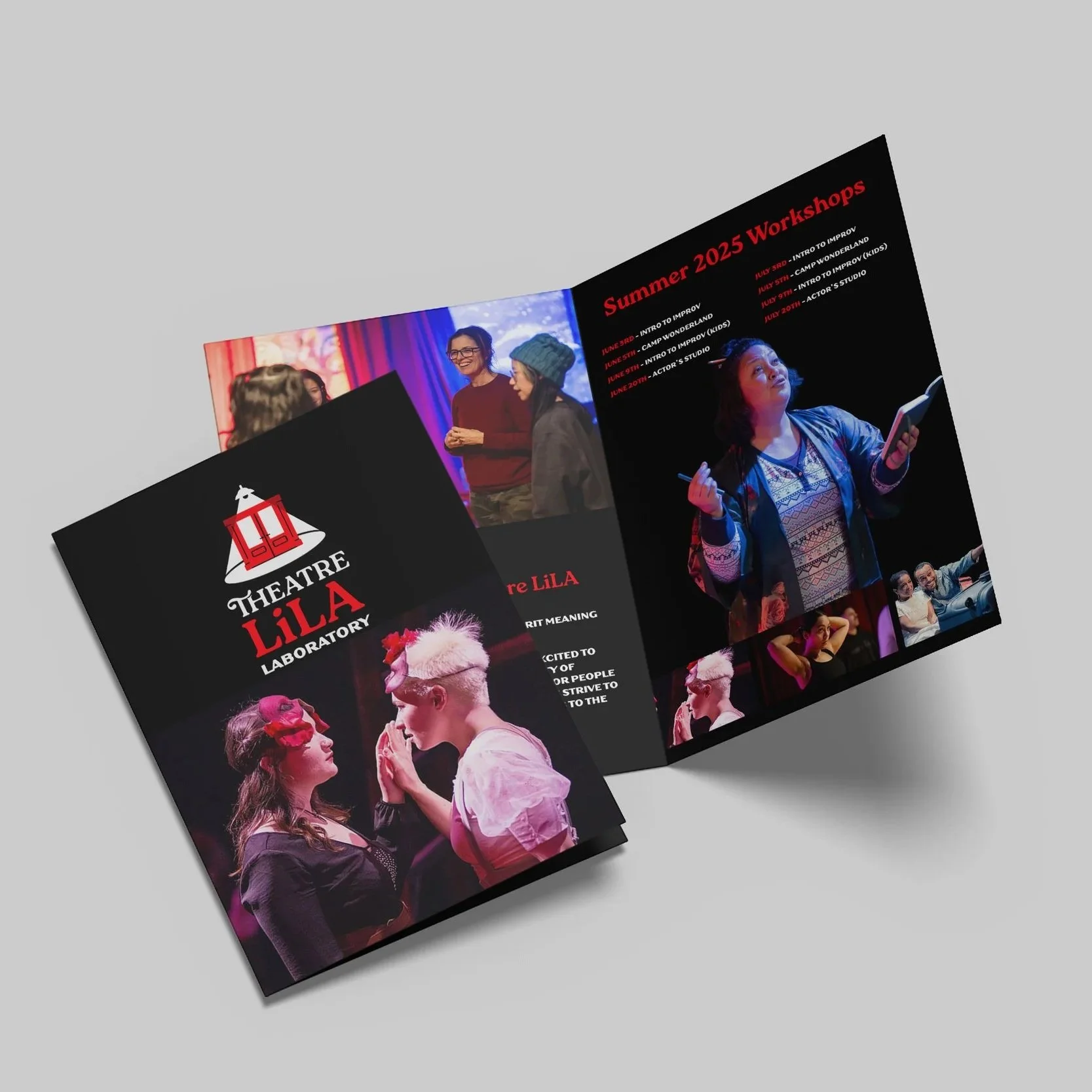
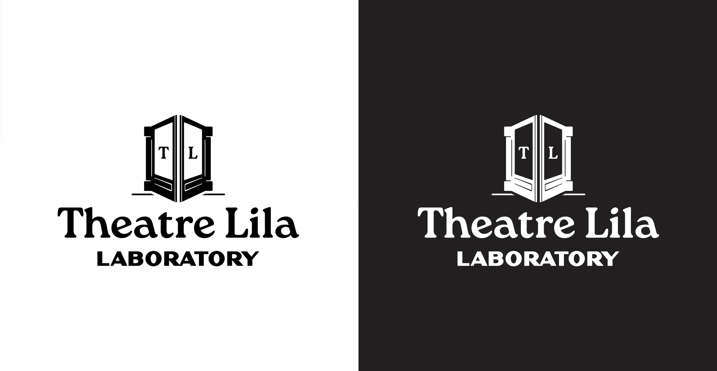
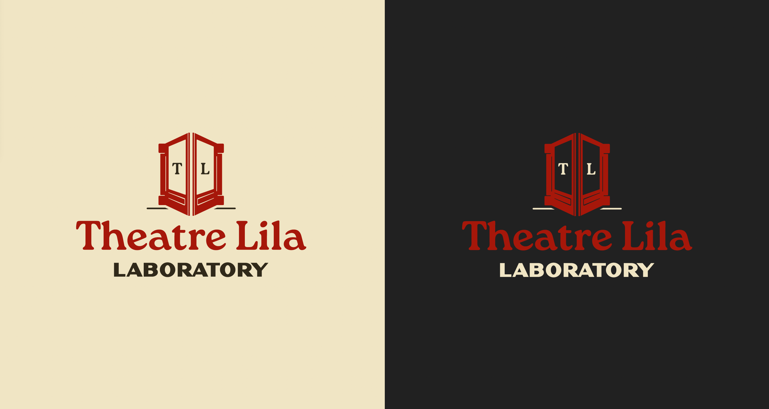
ART HOUSE 360, Theatre Lila Laboratory’s new home, needed a redesign to match the new space. I toured the space on multiple occasions to understand how it was going to change and to see how having a permanent space would change the brand. Jessica and I were drawn to the concept of using her new red door as part of her logo design. Since this is a theatre company, we wanted to convey theatre as well through the use of a spotlight. The use of the typeface Roca aligned with the feeling of movement as well as the unique qualities of Theatre Lila.
Highlights
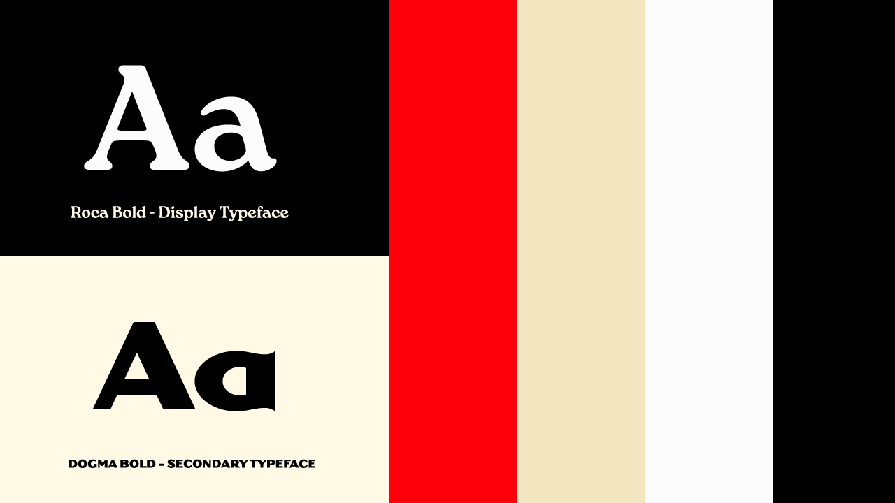
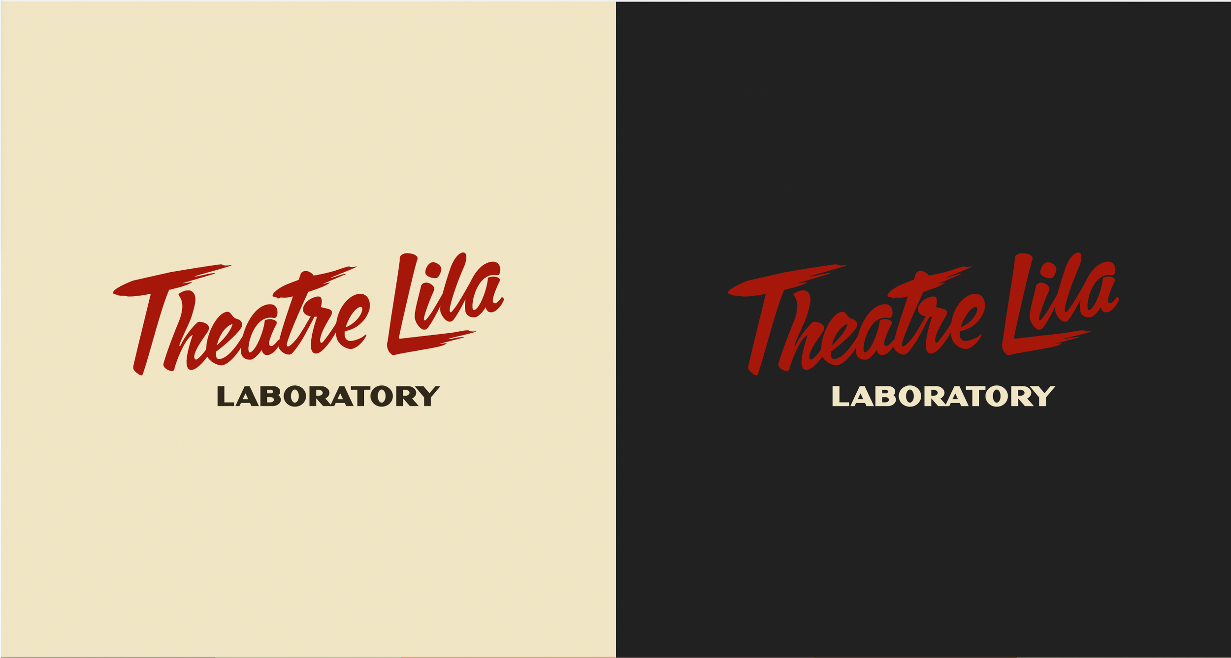
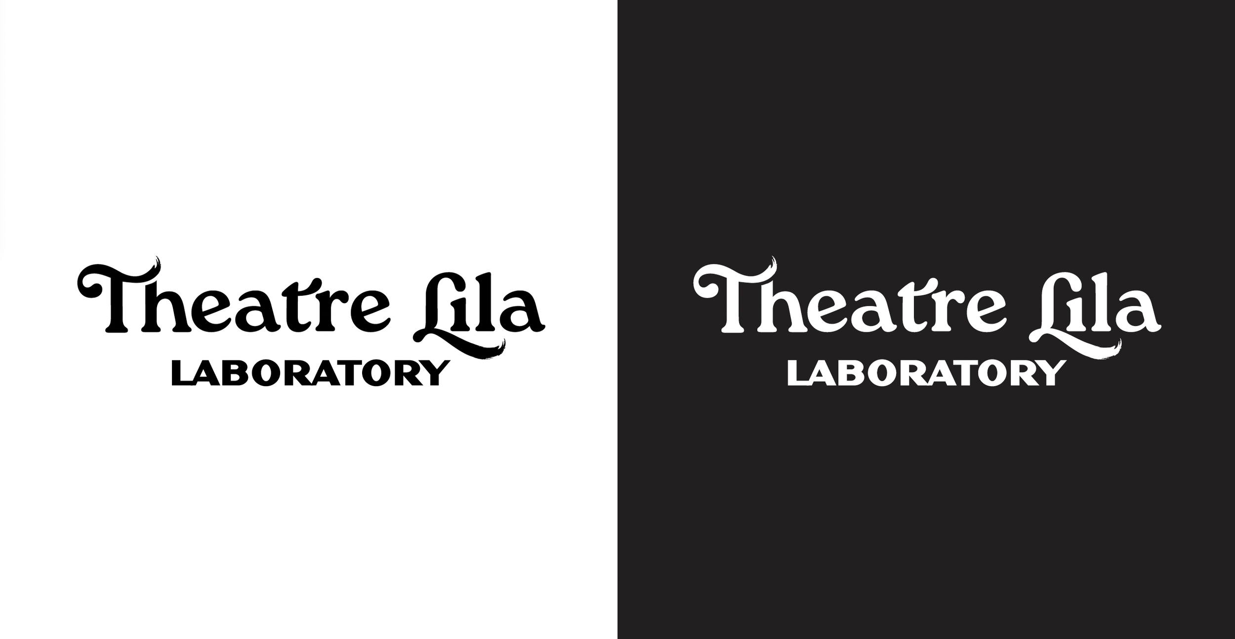
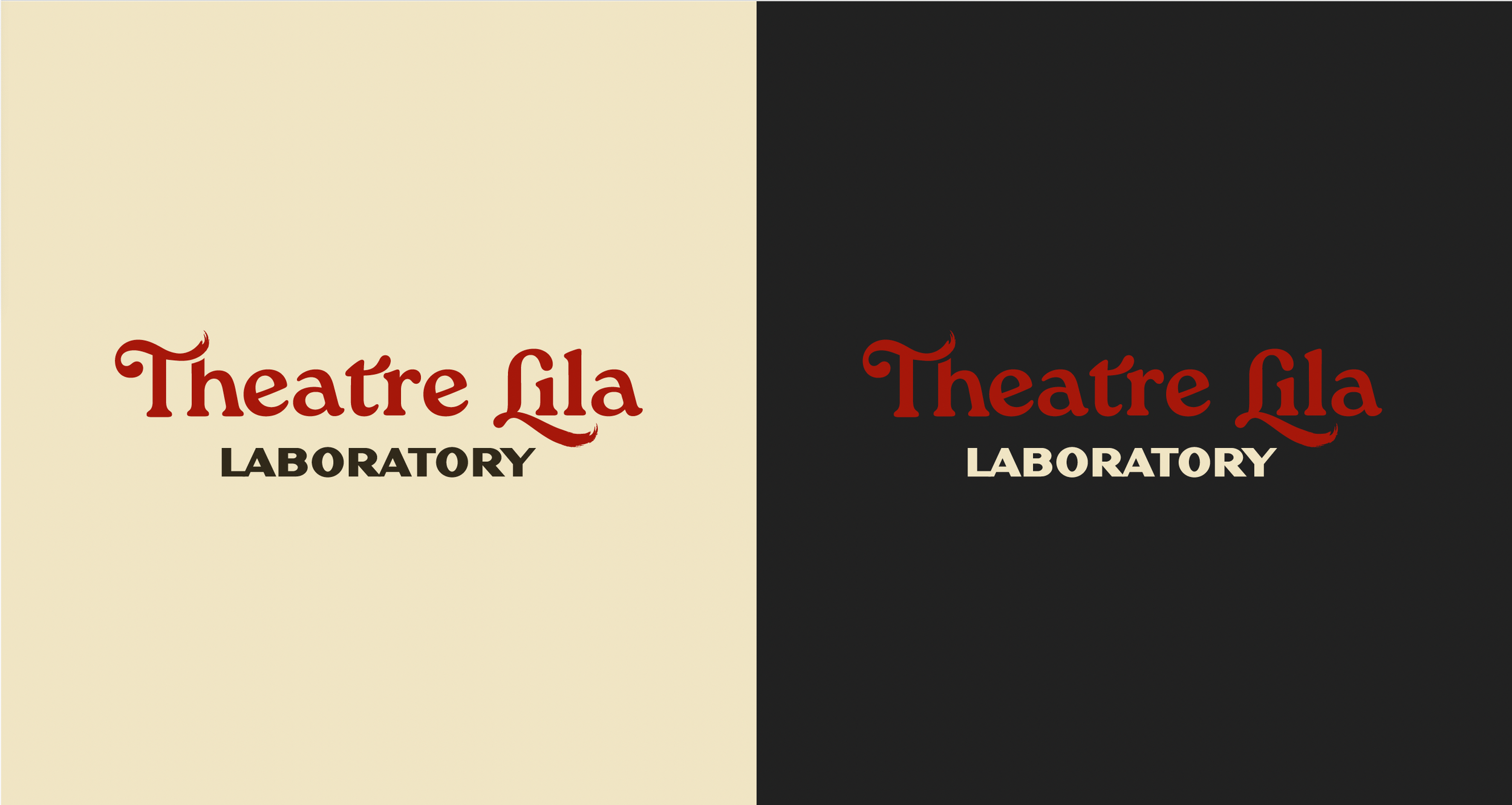
Branding
The branding is designed to feel playful, inviting, and electric, achieved by pushing the intensity of the red palette. The process was highly collaborative with Jessica Lanius of Theatre Lila, with frequent meetings to define and refine the brand’s emotional tone.
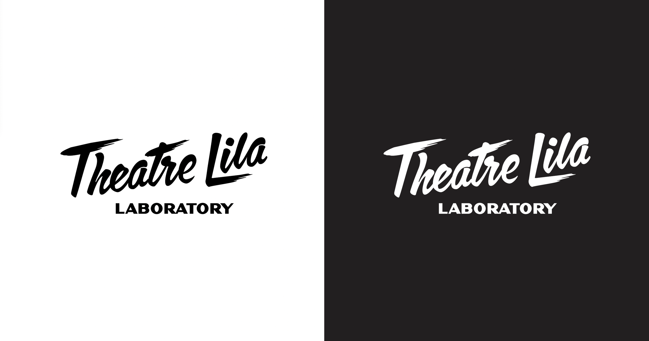
Logo Design
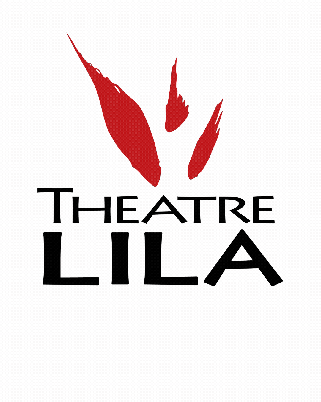
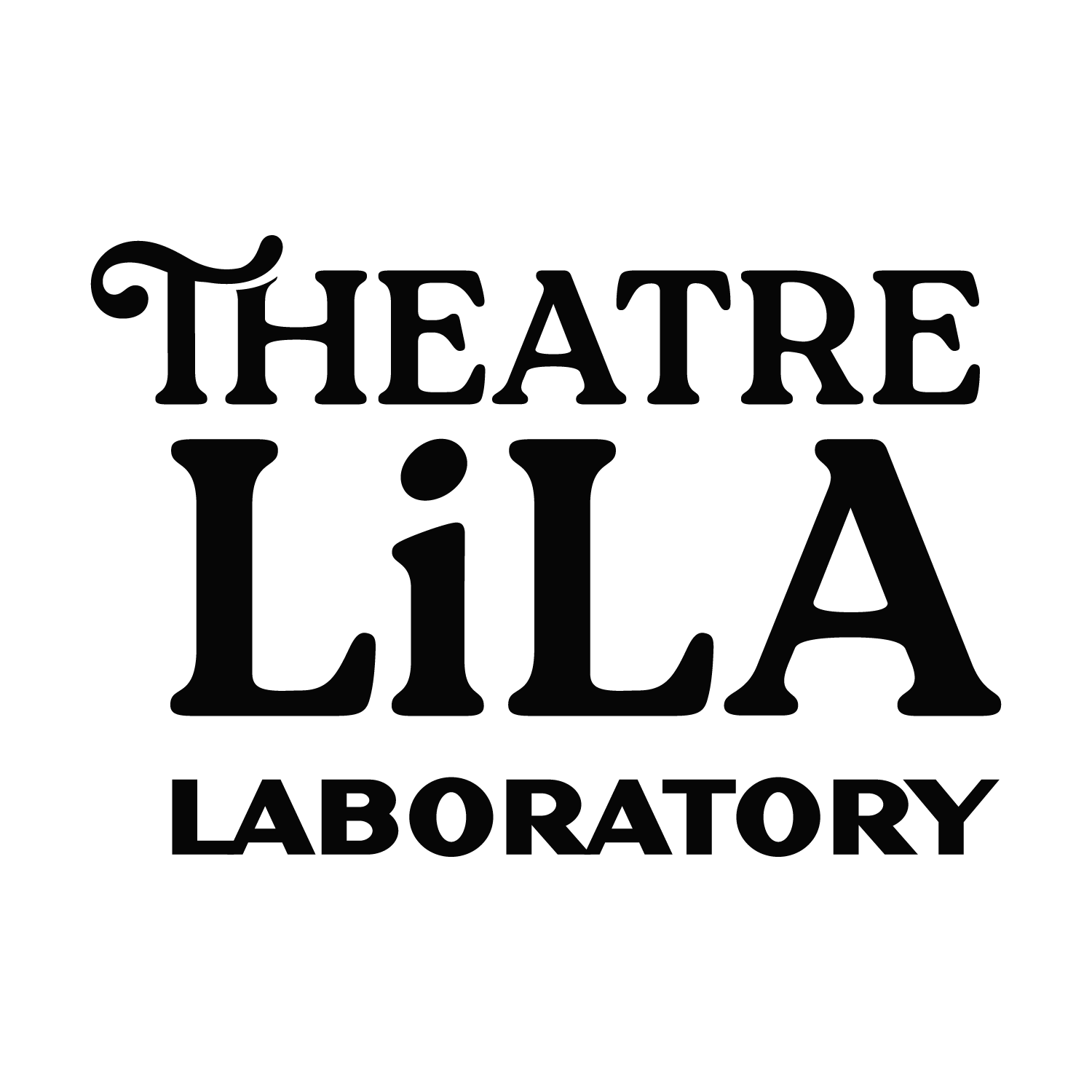
The logo uses a combination mark that can be separated into individual elements for flexible applications while maintaining brand cohesion. The door icon directly references the Theatre Lila space, while modifications to the Roca typeface introduce a playful character. The secondary typeface, Dogma, adds boldness while reinforcing the brand’s personality.
Brand Elements

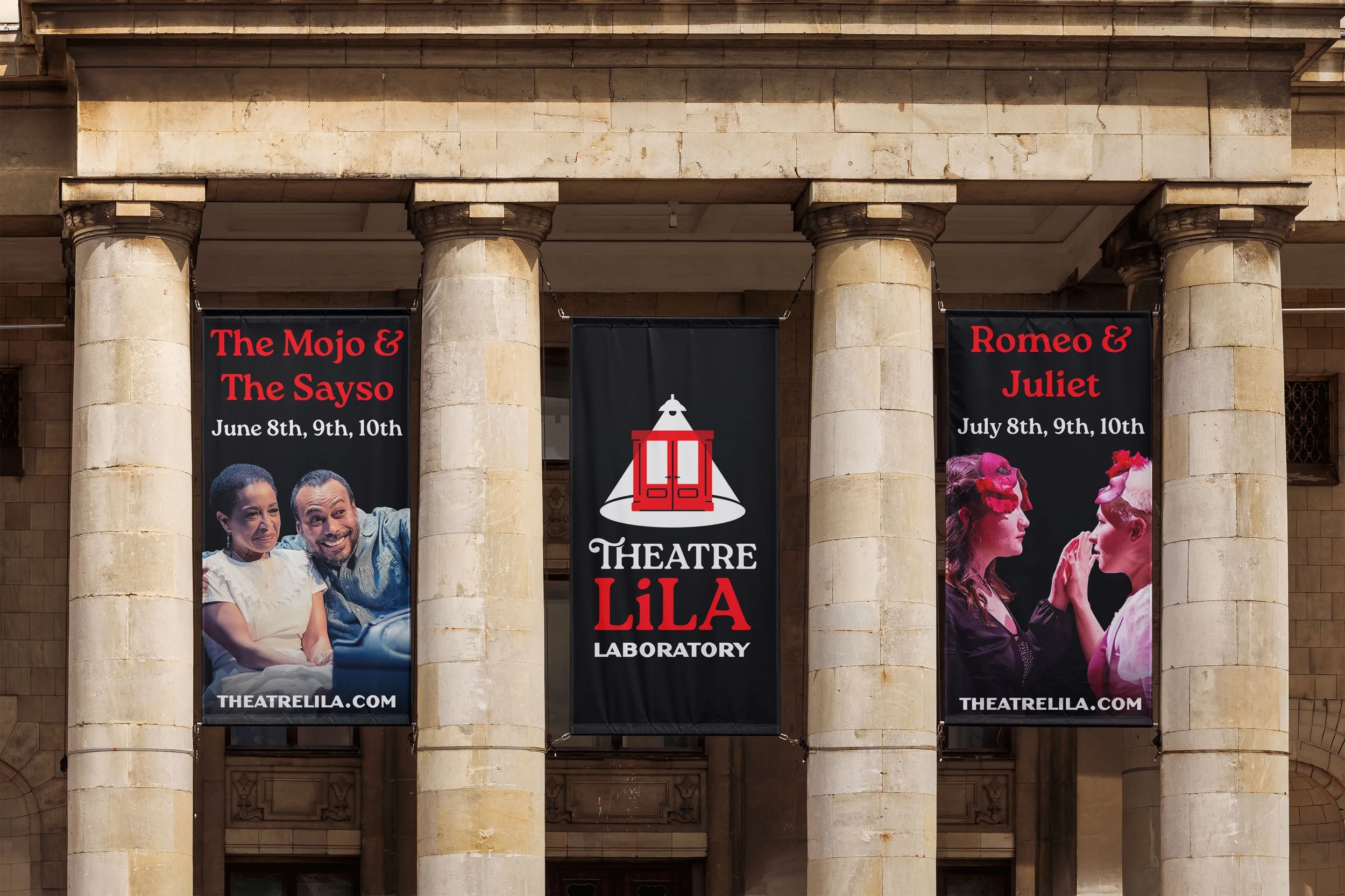
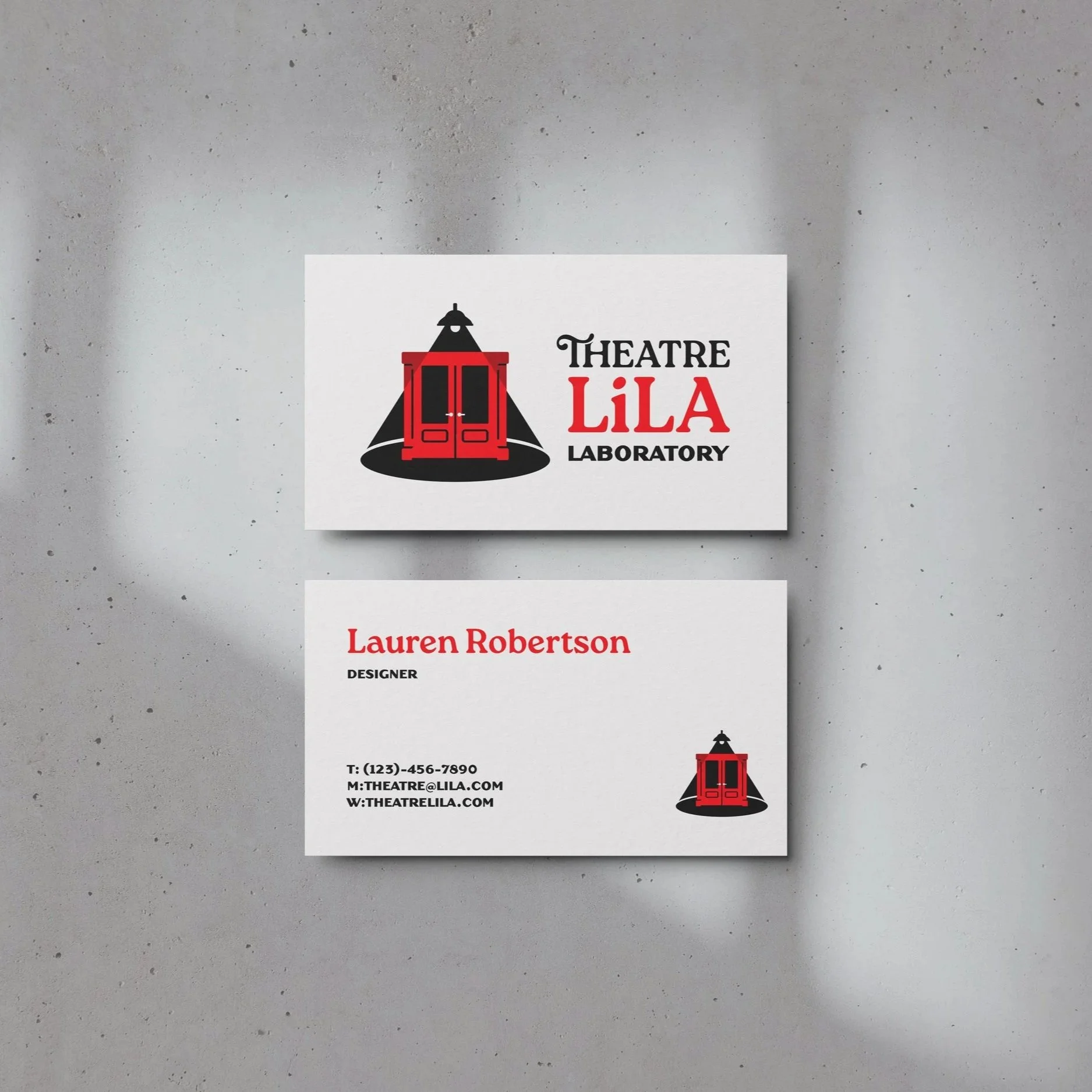
Mockups
Initial Concepts
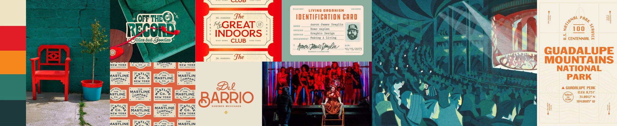
Stylescapes
Utilizing the Pinterest board put together by the founder of Theatre Lila I generated potential style directions for the rebrand. I labeled them with theatre based names. We decided to combine the two ideas to create a unique and fun direction for the rebrand. The combination honors the heritage of Theatre Lila (est. 2004) and brought it to the modern era.
1. Modern Revival
The bright colors made me think about the fun and flare of modern revivals. I wanted to focus on culture and an identity that looks great combined together but also as separate elements.
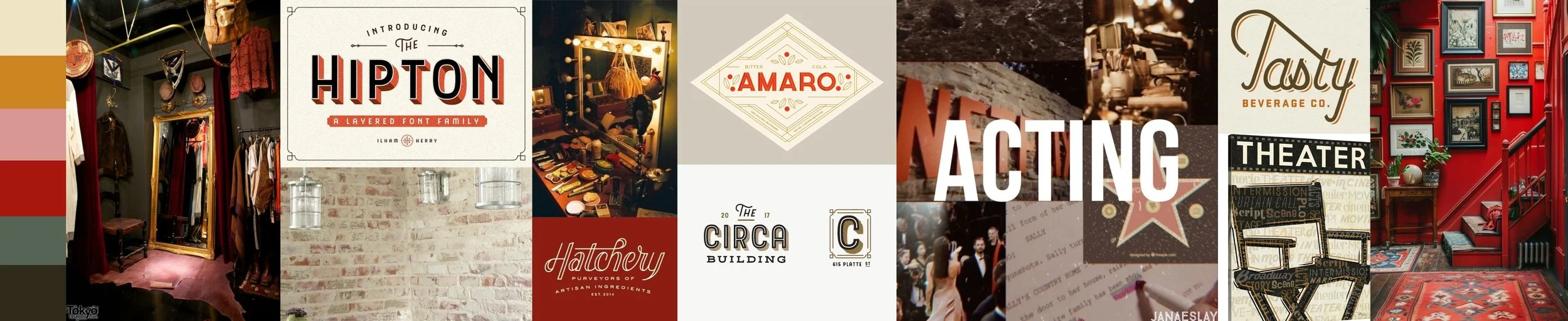
2. Costume Closet
This idea takes the concept of the behind the scenes of theatre. It’s meant to feel like a costume closet full of possibilities.